

The Business Card
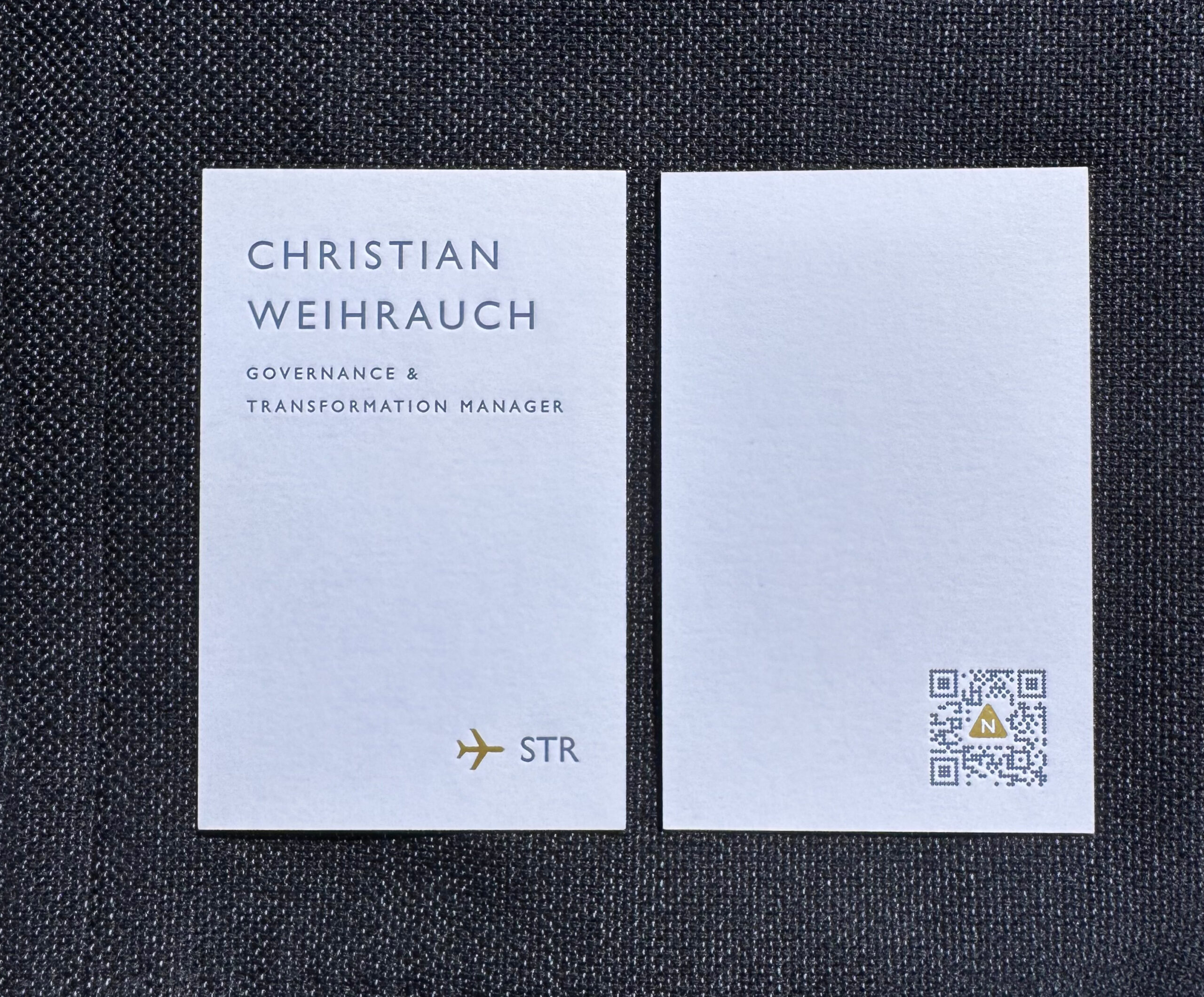
If you would like to learn something about my values, my standards, and my way of working, you are already holding one of the most important sources of information in your hand: my business card  .
.
– An objective view
Guiding Principle
I work in a world of data, systems, and complexity. My business card translates precisely that into a physical format: precisely designed, technically considered, and deliberately minimalist. It reflects my way of working — analytical, structured, and driven by a strong commitment to quality and responsibility.
In a digital landscape where so much feels interchangeable, this card aims to do something different: to convey personality.
A business card is small, yet it can express an attitude. In Japan, it is presented with both hands—a gesture of respect. It was this gesture that inspired me—not in its form, but in its meaning. The card is intended to reflect competence, high standards, and appreciation for the recipient.
Design & Configuration
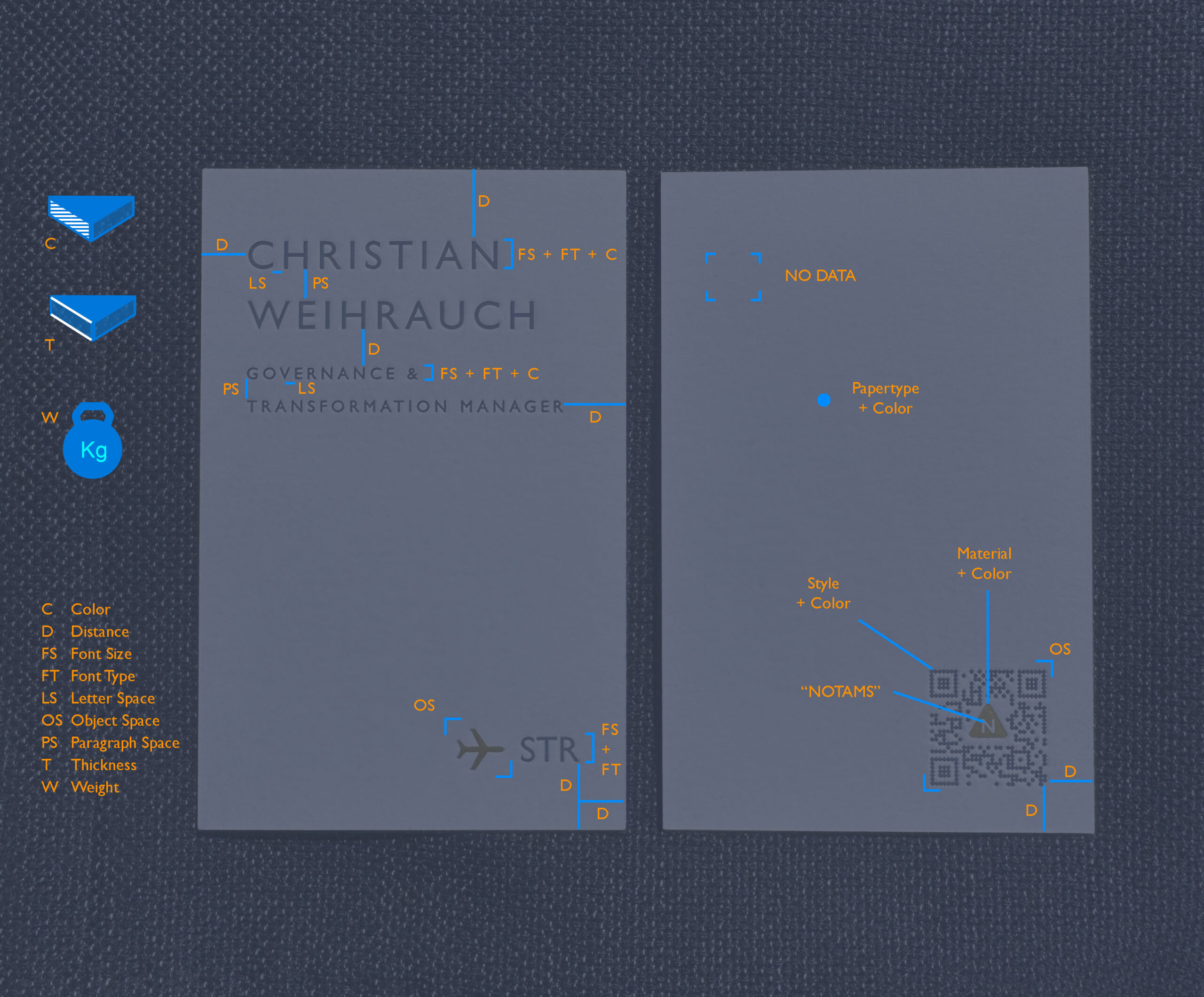
The entire design and all technical details originated with me, and I handled the implementation through to the pre-press stage. In total, this process required around 30 deliberate decisions, one layout program, two graphics applications, and one Pantone palette.
The Production

Conclusion
Naturally, you are best placed to judge whether the concept worked for you. I am open to constructive criticism; for me, it is part of the mindset needed to remain realistic and professional.
Important concluding note:
The card contains at least three substantive points from my fundamental principles.
| Complexity | Systems thinking, ability to structure, prioritization under uncertainty, ability to translate concepts, tolerance for conflict and ambiguity |
| Precision | Sound analysis, clarity of language, methodological precision, culture of learning from mistakes, commitment to quality. |
| Excellence | High execution competence, strength in shaping outcomes, leadership excellence, integrity management, outcome orientation |
–
Fun Facts
Complexity, Precision, Excellence at card-project
| Complexity | Managing the invisible interdependencies between visual balance, spacing, sizes, paper thickness, and embossing depth. Technical requirements for the QR code regarding readability, error correction, validity, and data protection. |
| Precision | The slightest deviations can disrupt the balance. All alignments must be precise, and every graphic element must be absolutely sharp. |
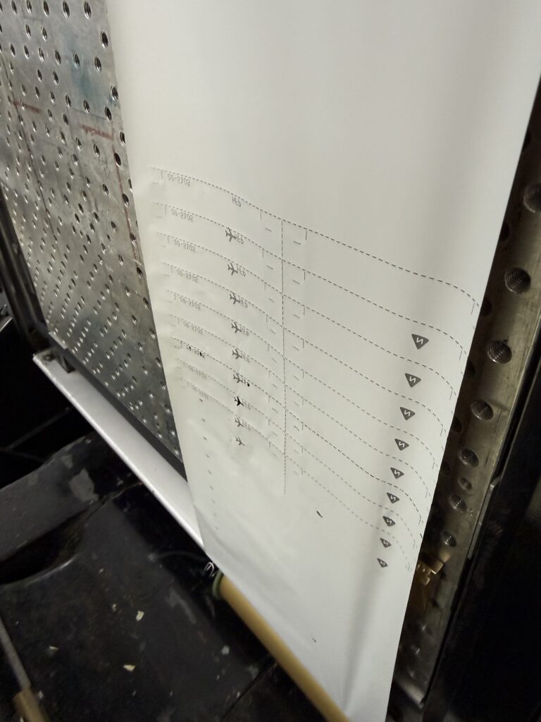
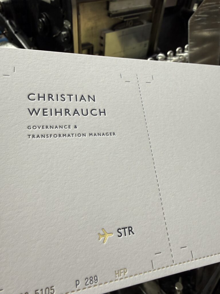
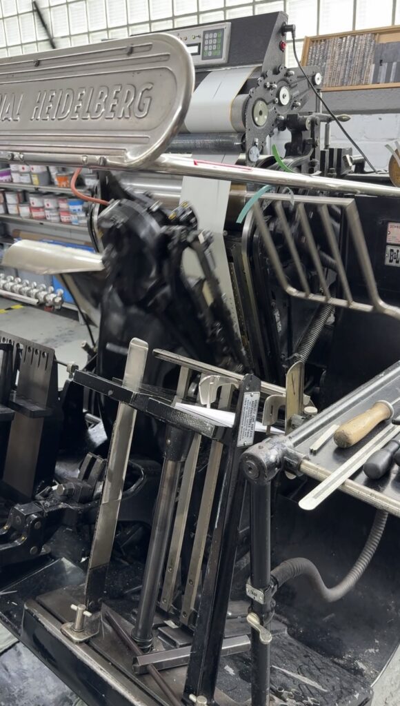
| Excellence | The high-quality physical execution by the manufacturer Letterjazz. My holistic approach—combining design, materials, tactility, and digital interaction—realized under time pressure. The website itself is a project in its own right, presenting additional challenges. |
Sequence of the manufacturing process
Eine kurze Auflistung wie der Prozess der Karten-Umsetzung aussah:
| Step | Thema | Kurzbeschreibung |
|---|---|---|
| 1 | Idea | What should be shown on the map and why or why not? What should be conveyed through material, weight and information? Which technology, if any, should be used or coupled (QR code, RFID)? |
| 2 | Sketches & Drafts | Initial exploration of typefaces, sizes, layouts, colors, and format. |
| 3 | Evaluation | Is the visual balance right? Is information potentially readable? Can the ideas also work technically? Are there any dependencies or restrictions when creating and using QR codes? |
| 4 | Print-ready artwork | At this stage, at the very latest, it is essential to use a program that supports vector graphics and reliably saves colors and color profiles. This also includes embedding the fonts used. |
| 5 | First print on the home printer to check actual proportions – potential re-evaluation with adjustments. | |
| 6 | Color management |
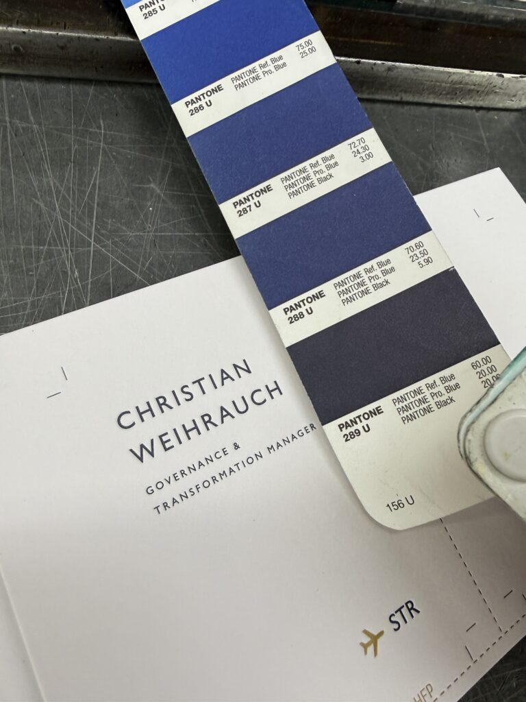
Coordination and selection of colors that the print shop can produce (in this case: Pantone).
Determining which colors serve as placeholders during the printing process—for example, to ensure that edges are transferred precisely onto gold foil. Mixed colors can create effects reminiscent of missing color gradations (similar to colorized black-and-white printing). |
| 7 | Evaluation of Colors | Compare with a color fan or calibrated monitor to check if the print colors match the on-screen view. → Select a different Pantone color if necessary. |
| 8 | Prepress Template | Export of the digital business card as a PDF with fully vectorized data and fonts converted to paths. This ensures the file is unalterable and stable for the print shop. |
| 9 | Physical properties | Selection and specification of paper type, paper thickness, middle layer or colored edges, paper color, type of gold foil and shade, paper weight, and embossing depths. |
Perfectionism? No:
I distinguish between excellence and perfection.
Perfection is a state that—if it is attainable at all—can only be achieved through enormous effort and with high-quality means. It is absolutely flawless and allows for no deviation whatsoever.
Excellence, on the other hand, means giving one’s best and achieving an outstanding result. There may be minor imperfections, yet the outcome is far superior to what would merely be an “effort.”
This distinction is particularly helpful when it comes to leadership, evaluation, and managing expectations: perfection can be paralyzing, whereas excellence enables high quality without setting the bar at an impossible level.
Pricing?
One card costs about 14 €